Wednesday, April 20, 2011

The Ubiquitous Paula Scher

I wonder how many people walk around New York City, saying "hey! that there is a Paula Scher," identifying her work in the same way people would say "hey, did you see that Van Gogh the other day?"

I googled Paula Scher, and it turns out she is everywhere. Now, I know just because you have a large portfolio does not necessarily mean that you can be easily identifiable anywhere, but Paula Scher has a certain hidden-in-plain-sight kind of presence in New York, at least to those who are or were not aware of her involvement. One of my favorites out of her logos is her design for the New York Philharmonic:

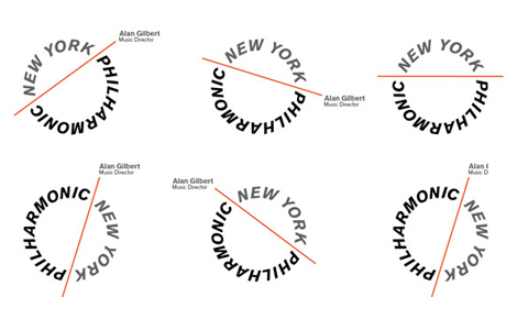
The New York Philharmonic's new graphic identity designed by Paula Scher.

It was also pretty fascinating to find out that Paula Scher was involved in these everyday package designs too:


So. iPhones.

Personally, I do not own an iPhone or an iPod touch. Do you? Well, frankly I'm tired of seeing hundreds (if not millions) of cases, accessories, and generally unnecessary add-ons for the iPhone when all I am looking for is something simple and practical for my perfectly functional alternative brand gadget. Maybe that's a bit harsh; I mean, it has its quirks, and if it weren't for the iPhone, this tactile silicone skin might never have been designed:


INViSUAL
"Used along with an app, [and] designed in mind for the Blind and the Visually Impaired with the need for special accessibility functions…This simple silicon case covers all the Apple iOS iPhone mobile devices with the help of the engraved bas-relief icons, keyboard and multi-touch scrolls that gives full access to the interface beneath." 


If you look closely, there are icons on the surface of the silicone case. Essentially, the tactile quality of the case transforms what was initially a primarily visual form of communication into a tactile one people can use in combination with the latest technology, which kind of makes me secretly want an iPhone or iPod touch.

Pluralistic Design: A Collaborative Effort

Fairly recently, the New York Times published an article on authors and how much influence they have when it comes to the designing their books' covers. Although the cover may suit the book's content really well, the reality is: not much. Many authors have their own website or blog to promote their books, and it often sounds like they have very little or no control at all. In "Cover Stories," which was published on August 10, 2008, Steven Heller says of authors and the degree of control they possess over the appearance of their books:
Most authors have no control over their book covers. The designs are chosen by an art director and approved by a committee; usually the author doesn't even see the cover until the process is completed. But some writers, by virtue of either their renown or contractual caveat, not only get to accept or reject designs, but also choose the designer. Although rare, prolonged designer/author relationships contribute personality to an author's books, even when the individual designs are decidedly different. The following are three cases of enduring chemistry. 


The discussed authors and designers include Milton Glaser + Philip Roth, Rodrigo Corral + Chuck Palahniuk, and John Gall + Haruki Murakami. Maybe it was because I had just finished defining key terms, but when I saw John Gall's cover designs for Murakami's novels, I was immediately reminded of the global presence of design, and of learning about Japan's emergence as a design-oriented nation in particular.


"Cover Stories," An Essay by Steven Heller


Words To Include In Normal Conversation

So far, my favorite is Bandersnatch.The most recent remake of Alice in Wonderland, directed in 2010 by Tim Burton, includes creatures that did not get to make an appearance in Disney's animated version of Alice in Wonderland created in 1951. For example, take the Jabberwocky: it is a creature that appears in Tim Burton's 2010 movie and is actually based on one of Lewis Carroll's nonsense poems.


Recently I came across this book design for Lewis Carroll's poem, which is often referred to as "Jabberwocky": 

Book design by Raphael Urwiller

 I was really attracted to the color scheme used for this design, it reminded me of the bright colors used in poster designs (I can't remember the exact name of the poster, but I will update this post as soon as I find out.  Although I don't know the name, I did some research and found this painting by Lester Beall using a similar color scheme.)

Retro Pix(els)

With all of the value people place on high-resolution photographs and pictures, not to mention high-definition plasma television screens, it's no wonder pixelated icons or typefaces that look like this are often called retro or outdated:

Animated gif by TopherChris on Tumblr

Conan Iotacon in Fortune Magazine
Andy Rash has created some interestingly humorous low-resolution portraits he calls "Iotacons." They've even appeared in Fortune magazine, where Rash's portrait of Conan O'Brien can be seen:

The iotacons' blocky, geometrically constructed forms makes them look as if they were created and published during the same time period Susan Kare developed the original Macintosh icons.


Macintosh Icons by Susan Kare

Here are some more iotacons (since I'm not a huge fan of Conan O'Brien; I just thought it was cool that Rash's iotacons style was published in a magazine): 

The Breakfast Club! (by Andy Rash)

Tuesday, April 19, 2011

Milton Glaser (Reverse?) Deja Vu

After we reviewed Milton Glaser's record album cover for The Sound of Harlem from 1964 and his Bob Dylan poster from 1967, I tried to figure out where I could have previously seen such bright, yet dimensionally flat color planes.

Milton Glaser's The Sound of Harlem, 1964.

Then I remembered that I had seen similar color planes in the animation style of the movie with the Beatles, The Yellow Submarine. Through some researching, I found out that the movie was produced in 1968, not very long after Milton Glaser designed the record cover for The Sound of Harlem. Heinz Edelmann, the art director known for his illustrations in The Yellow Submarine, was in fact, a friend of Milton Glaser, so influence or collaboration is not unlikely at all.

The Beatles by Heinz Edelmann
in The Yellow Submarine


Running Man

If you don't already watch Chuck, you should. It's a television show about a guy who accidentally uploads a computer into his head; the problem is that this computer contains all of the CIA's intel. The show airs every Monday at 8:00 pm on NBC, and when I was watching the opening credits, I noticed that they use an animated pictograph of a man holding a briefcase, looking like he had just jumped out of Roger Cook and Don Shanosky's Symbol Signs designed for the U. S. Department of Transportation in 1974.


Chuck Titles from parsons amt on Vimeo.


Good Busy Design

In 1924, the President of the Computing-Tabulating-Recording Company (CTR) , Thomas J. Watson Sr. changed the name of the company to International Business Machines, or IBM, the abbreviation we know today.

The Computing-Tabulating-Recording Company was established on June 16, 1911. This January, IBM started celebrating its one hundredth year and anticipation of its centennial birthday this summer with a plethora of articles on icons, playing on the word's definition as a representative symbol while acknowledging the company's iconic innovations. Each of the company's innovations, listed under "Icons of Progress" is represented by their own pictorial interpretation, which takes the shape of the number 100:

IBM Logo Design for its Centennial Birthday


In their "Icons of Progress" section they also celebrate IBM's belief that "good design is good business" by paying tribute to the company's original design consultant, Eliot Noyes, and artists who worked on his corporate design program. These artists included Charles and Ray Eames, Eero Saarinen, Paul Rand and Isamu Noguchi.