Sunday, February 27, 2011

The Composition of Words

B
eing an English major, I'd like to think I know something about words, or at least how to compose them to form a coherent point.
Typography involves the literal composition of words through the construction of letters to form an alphabet and then, the combination of letters to form words. The designers Scott Boms, Grant Hutchinson and Luke Dorny at Ligature, Loop, & Stem made an instructional poster on the anatomy of typography:


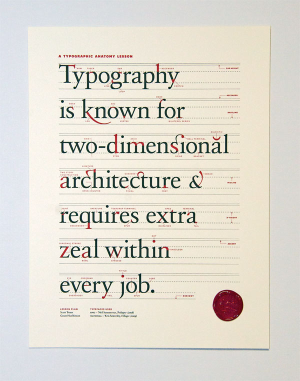
I didn't know there could be so many minute elements involved in the creation of a letter, not to mention a single stroke!


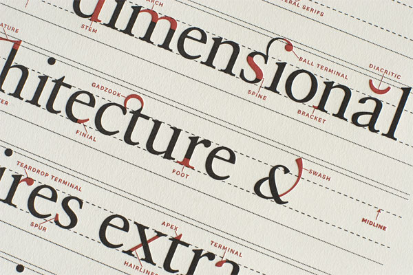
These are closeup shots of the Ligature, Loop & Stem poster
 [Click the images if you want to see other details of the poster.]


P.S. Thanks again to Jessica Hische for her daily drop cap!

Friday, February 25, 2011

From Posters to Blog Posts

Is anyone else glad that adjusting page layout or character alignment in Microsoft Word is a fairly simple matter of clicking through a few menu commands? I am. For some reason, one of the true/false questions on our midterm this past Wednesday just stuck in my head; this question was about poster composition and how their layout was determined. I don't remember exactly what it said, but I think it asked something about how type was arranged for poster composition, with an emphasis on the poster's vertical and/or horizontal format. 


Well, just as Jules Chéret and Henri Toulouse-Lautrec composed their imagery and typography specifically for the poster medium, graphic designers now are arranging their content for electronic, online media. 
Michael Surtees runs a design firm called Gesture Theory and a blog titled Design Notes. The way he adapted the Gesture Theory website for the ipad, computer screen, and the iphone reminded me of how visual posters were set and printed for circulation.


From Michael Surtees' post on Designing for the Browser of Today
P.S. Thanks to Jessica Hische for the daily drop cap by Linzie Hunter!

Friday, February 11, 2011

Doctor Who in Le Style Mucha

Alphonse Mucha disagreed with the phrase Art Nouveau. Why? He believed that art is eternal, and therefore cannot be called nouveau, which means new in French (Meggs). 

For those of you who don't know, Doctor Who is a British TV show produced by the BBC. It involves an eccentric man referred to as the Doctor who travels through time and space in a machine called the TARDIS (Time And Relative Dimension In Space), which is the blue police box you see behind Amy Pond in the image below. The show ran from 1963-1996 and has recently been revived and modernized, which aired its first contemporary episode in 2005.

Bill Mudron's
Amy Pond by way of
Alphonse Mucha

Although he did not actively associate himself with the Art Nouveau movement, Mucha became one of the most widely influential artists of the period. Many still use the expression le style Mucha interchangeably when describing the movement's most prominent visual characteristics, specifically in reference to the Art Nouveau period in France. Mucha gained recognition when his poster depicting Sarah Bernhardt as Gismonda appeared in Paris. It is around this time that Alphonse Mucha joined a group called the Salon des Cent, gaining an interest in symbolism; perhaps this contributed to Mucha's instantly recognizable style?

P.S. Did you know that Google celebrated Alphonse Mucha's 150th birthday on July 24, 2010 with a Doodle-of-the-Day?


You've Never Seen Type Move Like This

Based on the Chinese invention of woodblock printing and the concept of movable type, Shaun Chung has created a Rubik's cube that prints Chinese characters. The text on the cube is known as The Three Character Classic, also known as the San Zi Jing, an instructive text written by Wang Yinglin during the Song Dynasty on how to be a good person in society.
I'd like to try printing or solving one of these cubes.

Thursday, February 3, 2011

新年快樂! (Happy New Year!)

2011
Okay, if you are a werewolf or you count your days by lunar calendar, you probably know that today is the first day of the new (lunar) year. It is also the beginning of the year of the rabbit in the Chinese zodiac. 


The image on the right is a Chinese character or logogram: a graphic sign which represents an entire word, such as "rabbit." Can you see the similarities between the character's strokes and the rabbit's shape? 


Over time, Chinese calligraphy has evolved as both a writing system and an art form. It is currently written in two forms: traditional and simplified. Although many consider the traditional form more aesthetically appealing, the simplified form has reduced the number of strokes needed to compose each character, making it easier to write quickly. Curved, or uncial and miniscule letters were developed during the medieval era for similar reasons.