Showing posts with label drop cap. Show all posts

Wednesday, March 9, 2011

Design Travels Far


You know that phrase, the one that is all about location? Well, when I went to Garth Walker's artist talk on Wednesday, March 2, it was clear that his designs were very evidently based in Durban, South America. His location is especially important since one of the most prominent themes he explores through his designs is identity, which is very closely interrelated to a person's sense of place: "What makes me African – and what does that look like?" 

View more of Garth Walker's work here:
P.S. Thanks again to Jessica Hische for her Daily Drop Cap!

Sunday, February 27, 2011

The Composition of Words

B
eing an English major, I'd like to think I know something about words, or at least how to compose them to form a coherent point.
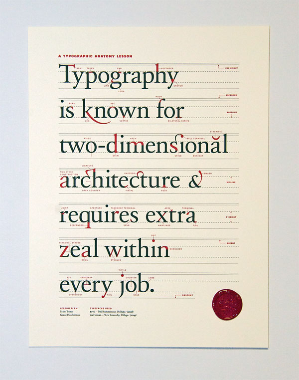
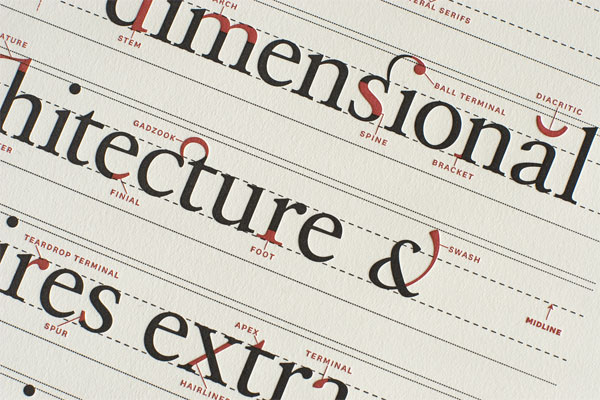
Typography involves the literal composition of words through the construction of letters to form an alphabet and then, the combination of letters to form words. The designers Scott Boms, Grant Hutchinson and Luke Dorny at Ligature, Loop, & Stem made an instructional poster on the anatomy of typography:


I didn't know there could be so many minute elements involved in the creation of a letter, not to mention a single stroke!


These are closeup shots of the Ligature, Loop & Stem poster
 [Click the images if you want to see other details of the poster.]


P.S. Thanks again to Jessica Hische for her daily drop cap!

Friday, February 25, 2011

From Posters to Blog Posts

Is anyone else glad that adjusting page layout or character alignment in Microsoft Word is a fairly simple matter of clicking through a few menu commands? I am. For some reason, one of the true/false questions on our midterm this past Wednesday just stuck in my head; this question was about poster composition and how their layout was determined. I don't remember exactly what it said, but I think it asked something about how type was arranged for poster composition, with an emphasis on the poster's vertical and/or horizontal format. 


Well, just as Jules Chéret and Henri Toulouse-Lautrec composed their imagery and typography specifically for the poster medium, graphic designers now are arranging their content for electronic, online media. 
Michael Surtees runs a design firm called Gesture Theory and a blog titled Design Notes. The way he adapted the Gesture Theory website for the ipad, computer screen, and the iphone reminded me of how visual posters were set and printed for circulation.


From Michael Surtees' post on Designing for the Browser of Today
P.S. Thanks to Jessica Hische for the daily drop cap by Linzie Hunter!