Showing posts with label typography. Show all posts

Sunday, April 17, 2011

Figurative Typography, Anyone?

The Raw Shark Texts is a book written by Steven Hall, which includes figurative typography along with its normal storytelling text format. I highly recommend reading this book; it's a compelling, fast paced read, and there's more figurative uses of typography within the book than what I am posting here, but I'm not saying you should read the book just because of its creative use of typography. The video below is from their marketing campaign for the book on Youtube.

Robert Massin created unprecedented figurative typography in Eugene Ionesco's La cantatrice chauve (The Bald Soprano) in 1964 with the photographer Henry Cohen by printing typography via letterpress onto sheets of rubber and then manipulating and photographing it (Meggs 443).


Tuesday, April 5, 2011

Geometry and Typography

Here's the official poster for this year's 64th Festival de Cannes, a film festival which celebrates international cinema:


What first struck me about this poster was the simple elegance of its design. Of course, while the elegance can be partly attributed to the use of a photo depicting the actress Faye Dunaway (photomontage, anyone?), it is the geometric '64' which becomes a main focal point. It actually reminded me of Rudolf Koch's Kabel light typeface from 1928. 


Tuesday, March 15, 2011

The London Underground

Harry (also referred to as Henry) Beck and Edward Johnston: both of these men have worked on graphics for the London Underground. Harry Beck was the designer of the map for the Underground, and Edward Johnston was hired by Frank Pick to create a typeface and symbol for the transportation system.

London Transportation Logos

This was one of the original maps of the Underground from 1933:

Harry Beck's design for the London Underground Map in 1933.

And this is a much more recent and modern interpretation of the London Underground system as of this year, 2011:


Chromaroma from Mudlark on Vimeo.

Tuesday, March 8, 2011

Circular Logic

Wow, talking about typography has made me realize how mistaken I was about graphic design when I started this blog. Typography is one of the most straight forward methods of visual communication, so I've been looking at various designers' typefaces.


Albrecht Dürer's studies in the formation of capitals influenced how letters are constructed in typefaces today, and this focus on geometric proportions can be seen in Herbert Bayer's sans-serif Bauhaus typeface called Universal, designed in 1925.

Universal, a typeface focusing on lowercase letters made of circles and lines.

Here is another variation of Herbert Bayer's Universal typeface:


Monday, March 7, 2011

Linotype: It's Pronounced "Line-o-Type"

Johann Gutenberg succeeded in mechanizing handwriting with his invention of the press and adaptation of metal movable type, but there were still many steps that involved manual preparation of the press itself. In 1886, Ottmar Mergenthaler automated one of the most time-consuming stages of the printing process: type setting. Rather than casting and setting type one at a time, Mergenthaler's Linotype machine produced a full line of type. Here's a video I found on Vimeo about the Linotype machine:


"Linotype: The Film" is a documentary about Ottmar Mergenthaler's amazing Linotype typecasting machine and the people who own and love these machines today.

Director & Editor: Douglas Wilson
Director of Photography: Brandon Goodwin
Audio & Sound Design: Jess Heugel
Music: Cornbelt Chorus "Drunk Hymn & Interlude"

Sunday, February 27, 2011

The Composition of Words

B
eing an English major, I'd like to think I know something about words, or at least how to compose them to form a coherent point.
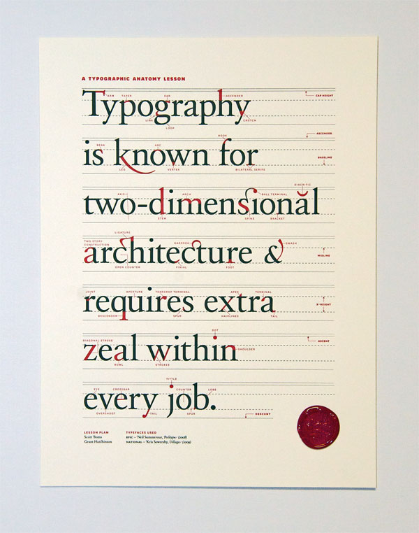
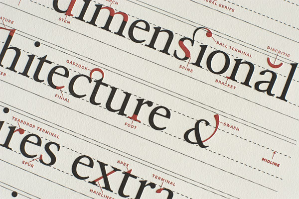
Typography involves the literal composition of words through the construction of letters to form an alphabet and then, the combination of letters to form words. The designers Scott Boms, Grant Hutchinson and Luke Dorny at Ligature, Loop, & Stem made an instructional poster on the anatomy of typography:


I didn't know there could be so many minute elements involved in the creation of a letter, not to mention a single stroke!


These are closeup shots of the Ligature, Loop & Stem poster
 [Click the images if you want to see other details of the poster.]


P.S. Thanks again to Jessica Hische for her daily drop cap!

Friday, February 11, 2011

You've Never Seen Type Move Like This

Based on the Chinese invention of woodblock printing and the concept of movable type, Shaun Chung has created a Rubik's cube that prints Chinese characters. The text on the cube is known as The Three Character Classic, also known as the San Zi Jing, an instructive text written by Wang Yinglin during the Song Dynasty on how to be a good person in society.
I'd like to try printing or solving one of these cubes.

Thursday, February 3, 2011

新年快樂! (Happy New Year!)

2011
Okay, if you are a werewolf or you count your days by lunar calendar, you probably know that today is the first day of the new (lunar) year. It is also the beginning of the year of the rabbit in the Chinese zodiac. 


The image on the right is a Chinese character or logogram: a graphic sign which represents an entire word, such as "rabbit." Can you see the similarities between the character's strokes and the rabbit's shape? 


Over time, Chinese calligraphy has evolved as both a writing system and an art form. It is currently written in two forms: traditional and simplified. Although many consider the traditional form more aesthetically appealing, the simplified form has reduced the number of strokes needed to compose each character, making it easier to write quickly. Curved, or uncial and miniscule letters were developed during the medieval era for similar reasons.

Monday, January 31, 2011

The Codex

Codex: what a cool name for a book.
 It’s too bad the word didn’t stick for more contemporary forms of literature like the novel, but that’s because the word refers to a specific type of book; specifically manuscripts, which contain scripture or some kind of ancient writing. Even though the name is not commonly used, the codex-style bookbinding technique can still be seen everywhere.

How to make your own book, codex style.


Literally, I mean everywhere. In 2006, ArtStage, “a privately sponsored, public art exhibition” in Toronto, Canada, presented outdoor sculptures people could see on the way to a nearby airport.


Although The Book by Ilan Sandler’s size makes it easily seen from a distance, a closer look shows that there are shapes cut into the pages of the steel book sculpture.

The Book and its lost page

These shapes form clusters of words, which the artist refers to as “clustered texts [that] link the letters of the Latin alphabet to its predecessors, which include the Phoenician alphabet that emerged from Egyptian hieroglyphs...The future imprints of text on a page are dependent on their ancestral roots as well as the symbolic languages, codes, and alphabets that are evolving out of our contemporary society.”

Wednesday, January 26, 2011

Introduction (Or Assignment 1)

Hi!
About graphic design, I have never really thought of it as something that involved specifically written forms of communication, such as typography. I often place more emphasis on the word ‘graphic’ for its suggestion of images or symbols as a means of communication, like how they are used in signs or graphic novels. It just had not occurred to me that graphic design would also include letters or text, because if an image could already convey the message, why add text to it? (Wait, no, let me rephrase that.) I did not really think of text as an artform; I knew about fonts, and I knew that they could decorate (or be decorative), but they just didn’t quite register in my mind as, well, Art.

However, if graphic design = visual communication, then the inclusion of typography in design, such as a font on a book cover, makes perfect sense.

My name is Athena and I am an English (Literature) major with a minor in Art History, looking to work in the book publishing industry. I think that knowing the background of graphic design would make it easier to see how and why people use or respond to its more current applications, particularly when it comes to books and what people are reading.